


Not that the Polish złoty needed a unique symbol at the moment, however, it will not do any harm to conduct graphical experiments from time to time.
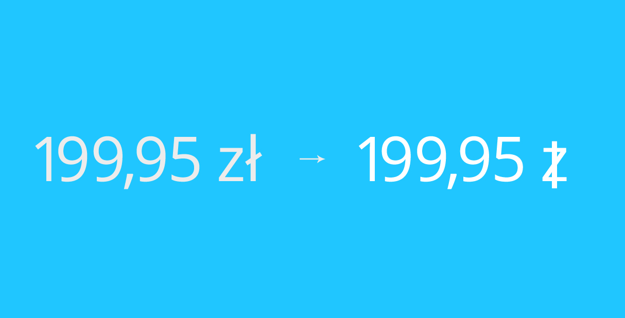
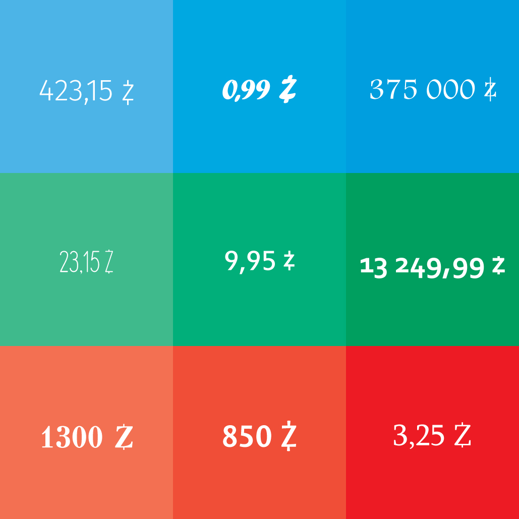
To start, let’s give some basic information. Polish złoty is, as you might guess — the currency of Poland. At the moment it has no official symbol and its role is fulfilled by the first two letters — “zł”. Examples of usage: “0,99 zł”, “15,35 zł”, “215 zł”, “375 000 zł”.
In other words, the current symbol is a simple abbreviation of the name, which, of course, is incredibly convenient and beneficial from the financial point of view. Let’s consider these two advantages in detail.
The “zł” abbreviation has the following positive points from the convenience perspective:
- easy to remember, since it is derived from the full name;
- easy to replicate, both manually and online;
- a common and clear symbol to the entire population of the country;
- non-standard compared to other currencies.
The first three points, in general, are quite clear, but I would like to elaborate on the last one. First of all, the złoty is unique, unlike, for example, the krone (Czech Republic, Denmark, Norway, Sweden), ruble (Belarus, Transnistria, Russia), as well as a variety of pounds, dinars, liras, and so on. In addition to the name itself, the letters that are used in the current symbol are not much in use in Western European languages. The letter “z” is used much often in Polish than in other European languages, and the letter “ł” in addition to Polish is only used in a couple of other minor languages.
As a result, we get a nice combination “zł” which looks pleasantly and unusual for most speakers of the European languages, regardless of whether they have Latin or Cyrillic as their native alphabet (for carriers of other languages any Latin or Cyrillic letter is already a novelty in itself).
What comes to the second advantage — financial, this point is quite obvious. It is a very expensive process to develop a new symbol of the złoty. Most of the costs will not even go on the symbol itself but on its implementation at the state level (changing the documents, websites, laws, databases, and so on). And all this is in light of the fact that Poland should enter the Eurozone in the future and will start using the Euro.
However, we should not forget that “zł” is just an abbreviation just like “dollar”, “euro” or “pound”, and the EU itself is in a kind of existential crisis, so I will not claim that the złoty will soon disappear as a currency.
It should also be kept in mind that the countries decide on the choice of the symbol of their national currency for a variety of reasons. Here are some of them: raising the prestige of the currency as well as confidence in it, the desire to be more noticeable on economic and financial markets, the desire to differ from other similar symbols and currencies, increase the practicality and convenience of the currency in daily use.
I will not go into a deeper analysis of the reasons why countries decide to adopt a symbol for their currency. I would just like to add an interesting observation that countries that have recently established symbols for their currencies are not the most developed in economic terms. Georgia, Russia, Turkey and Ukraine come to mind. At the same time, such rich countries as the Czech Republic, Switzerland, the Scandinavian countries and others are not in a hurry to create symbols for their currencies. Partly because of the already stated fact about the Eurozone, partly, I assume, because of the high cost of this procedure and in more democratic countries with more transparent decision-making processes it is more difficult to sell an expensive “toy” to the voters under the pretext of “national greatness”. But it is just an assumption.
Let’s now leave the theory behind and start with the practice. Considering the fact that it is difficult to predict what will happen to the Eurozone and the złoty (maybe in ten years we all will be using bitcoin), this exercise involves an idealized situation: we have the złoty, that requires a symbol — that’s it.
The requirements to the symbol are straightforward:
- a visual affinity with the current “zł“ symbol is preferred;
- should be more convenient in use, both on the paper and online;
- should be easily replicated, both manually and online;
- should be easy to remember;
- should not be confused with other currencies, symbols and letters.
Before turning to my proposal, I’ll share what I found online:
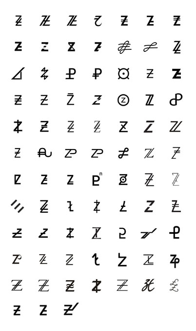
There are many different symbols, some are interesting, but the vast majority does not meet my listed terms (try to manually replicate some or just even memorize).
The version, from which I started, is represented in this collection by three exemplars. Actually, I thought that it was the most obvious, simple and elegant variant. Here, as an example is the creation logic:
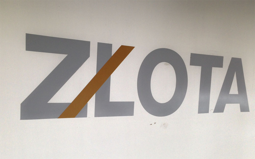
It is a construction banner in Warsaw a couple of years ago. The highlighted part just begs to be shifted with the “L” letter towards “Z”. Let’s conduct a graphical transformation:

As you can see, it is a very natural symbol in terms of its formation: overlaying one letter by the other. We could stop at this point, but something is wrong — the vertical line is too massive, creating a visual tension and congestion in the center of the letter.
It would be appropriate to compare this symbol with the dollar sign ($), as they are graphically akin, but the American currency doesn’t have an additional controversial point, which is present in this Polish variant:

On the one hand, the Catholic Church will rejoice to the upper cross but will be upset after seeing the lower one (if I’m not mistaken, it is a symbol of Satanism). But we should not give up on the symbol. If we continue our transformation, we get…

A clear and an understandable symbol without any religious allusion.
And when it comes to handwriting, I would use “z” with the vertical line, as no religious associations appear when writing by hand. Of course, one can use the “lightweight” version (with the dashed line) — there is also no difficulty in its replication.
An additional advantage would be that the new character is written by hand on a quarter or even a third of the time faster (depending on the individual writing speed), than the “zł” abbreviation.
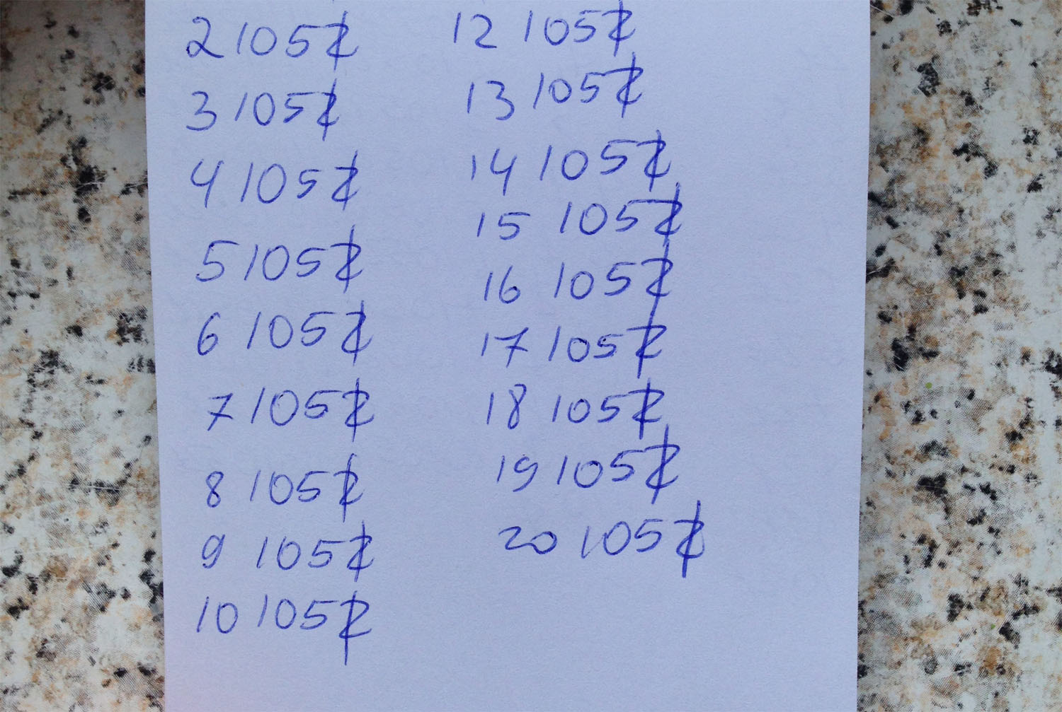
A couple of ads with the proposed symbol:


It should be noted that the symbol is quite flexible in its graphical representation, as, in fact, are the US dollar and cent. Take a look at their graphic variability:


As you can see, both symbols use different stylizations: one or two lines of the dollar, as well as a partial or a full overlay of the vertical line on the main symbol. So the proposed symbol of the Polish złoty has one more advantage — designers and font creators will be able to choose any suitable, in their opinion, design of the symbol. A couple of examples of the different forms:
However, the analysis would not be complete without specifying the downsides of this symbol. Here are the ones I came up with, in addition to the economic feasibility of switching to a new symbol:
- the different writing style on paper (full vertical line) and online (partial) may be confusing at first;
- if you use the full vertical line, and not the partial one, one still has a chance to create an association with the crosses;
- there is a chance to confuse with other letters of the Polish alphabet: “ź” and “ż”.
However, I don’t think that these disadvantages are too significant, and the second and third points are entirely dependent on the talent of the (font) designer who creates a poster or a font.
Let’s sum up. Despite the economic inexpediency, the proposed symbol of the złoty fits neatly in the graphical environment and meets all the enlisted requirements — usability, memorability, simplicity.
Nothing keeps from using it right away and any designer can recreate the symbol in his work. For comparison, the symbol of the Russian ruble, before being officially approved, has come an amazing way from the “bottom” to the “top” due to its relatively widespread use by various businesses, designers, and people. If there are brave souls who will begin to use the proposed symbol — please send your work to us, we will be happy to add it to this material.
Once again, congratulations on all the holidays and… We wish you a million złotys!


Comments